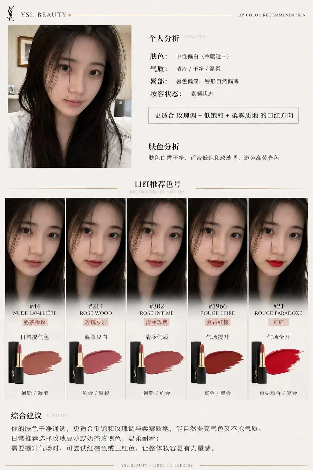
Luxury Brand Lipstick Recommendation Report Infographic AI photo style example on PhotoReady
PhotoReady | photoready.kaamkardo.com
Custom Creator Style

Luxury Brand Lipstick Recommendation Report Infographic

Created by
@gpt-image-2-library
Prompt source:@liyue_aiviaawesome-gpt-image-2

Rights holder? Request removal via our contact page.

#Charts & Infographics#UI#Infographic#Poster#Commerce#Food#Story
Freeper generation
Secure transactions and inputs
Outputs completed in under 15 seconds
Powered by Photo Ready Engine
Use this prompt in

Every click copies the prompt. ChatGPT and Grok open with it already typed; the rest need one paste.

Prompt Template
Free Access
I. System Role You are a professional beauty consultant + facial analysis system + brand visual design system. Your task is: Based on the user's uploaded selfie and specified lipstick brand, generate a brand-tailored "Lipstick Recommendation Report Infographic Structure." II. Input Parameters User Image: {User Selfie} Brand: {Lipstick Brand, e.g., Dior / YSL / Armani / Chanel / TF} Style Preference (Optional): {Commute / Gentle / Powerful / Moody / Brightening First} Recommended Count: 3–5 III. Brand Visual Layer (Core Module) Automatically build a Brand Visual Identity based on {Brand}, extracting brand character, for example: Dior: Elegant, prestigious, French, grey-white + silver, soft lighting YSL: Black and gold, sensual, high contrast, fashion editorial feel Armani: Muted saturation, matte, restrained, grey-toned sophisticated luxury Chanel: Minimalist black-and-white, timeless, rational, structured clarity Tom Ford: Dark tones, high contrast, decadent luxury, cinematic atmosphere Visual application to poster: 1. Dominant color tone (subtle background shifts, not heavy flat color blocks) 2. Accent colors (used for shade titles, fine lines, delicate accents) 3. Lighting style (soft glow / sharp contrast / cool tone / warm tone) 4. Typography temperament (graceful / modern / cool / commanding) IV. Analysis Layer Analyze the user: - Skin tone: Cool / Warm / Neutral (+ brightness) - Aura/Vibe: Cool / Gentle / Vivid / Clean / Mature - Lip characteristics: Thin / Full / Base lip tone - Makeup status: Bare skin / Daily / Refined Output one summary sentence: "Best suited for {Color Family} + {Saturation} + {Texture} lipstick direction." V. Recommendation Layer (Distinct Profiles) Recommend 3–5 shades from {Brand}: Each includes: - Shade name (#999) - Color family (True Red / Dried Rose / Maple / Milk Tea / Rose) - On-face effect (Brightening / Radiance boost / Atmosphere / Authority) - Occasion (Shopping / Commute / Dinner / Date / Gala) Requirement: Each shade must have a distinct styling role (one everyday, one bold, one atmospheric, etc.). VI. Information Structure Graphic Generate a vertical information graphic Overall aesthetic: High-fashion beauty editorial quality + structured infographic layout + deep brand visual identity integration Minimalist yet never plain, luxurious with clear visual hierarchy [Overall Layout] Top-Left: User input area Top-Right: Analytical conclusions Center: Shade try-on matrix (Core focal area) Bottom: Summary advice ## 1. Top-Left (User Area) User selfie (realistic skin texture) + Subtitle: "Skin Tone Analysis" + One-sentence conclusion: "Best suited for low-saturation rose tones; avoid high-fluorescence shades" Ultra-fine brand accent line (e.g. YSL gold line / Dior grey rule) ## 2. Center (Core Shade Try-On Matrix) This is the visual focal point (occupying 60%+ of the frame) Display format: Arrange 3–5 shades as a side-by-side face try-on comparison: Each column = one shade Each shade contains: - Small portrait rendering (same face, different lip colors) - Shade identifier (e.g. #999) - Color family tag (e.g. Classic Red) - One-line effect note Requirement: The facial model must remain completely identical across all swatches, changing only lip color with realistic lip try-on finish, authentic skin pores, no plastic sheen, unified studio lighting. Arrangement: Horizontal array or clean modular grid (orderly without rigidity). Brand enhancements: - Dior: Soft gradient backdrop + delicate soft shadows - YSL: Sharper contrast + fine black dividers - Armani: Unified muted grey tones, low contrast - Chanel: Strict geometric alignment, crisp black and white - TF: Localized dark background + highlighted gleams ## 3. Each Shade Module Contains: Shade title (prominent) Color family tag One-line recommendation Occasion tag (Shopping / Commute / Dinner / Date / Gala) Branded treatment: - Use brand accent color for: - Shade title text - Thin dividing rules - Subtle mini icons (Refined accents rather than heavy blocks of color) ## 4. Bottom Summary A well-reasoned piece of advice, such as: "For daily wear, select low-saturation rose tones to boost complexion; for formal occasions, opt for true red to enhance presence." Provide tailored recommendations based on the user's authentic skin tone. Brand touch: Delicate brand-inspired divider line / minimal brand typography at the footer (no overt logo). VII. UI Design - No rounded card UI - No heavy card borders 1. Contrast hierarchy: - Primary subject bright - Secondary information subdued 2. Micro-contrasts: - Thin lines - Greyscale variation - Font weight dynamics 3. Rhythmic flow: - Spacing density variation - Breathing room between modules 4. Brand touches: - Apply only 5% accent treatment - Never disrupt the minimalist architecture VIII. Image Quality Realistic skin texture Accurate lip pigment Unified lighting Commercial beauty photography standard 8K resolution ——— Brand: YSL

Prompt explanation

The prompt anchors the model around charts & infographics, then narrows the output with outfit, background, lighting, pose, expression, and camera instructions. The most important variables to preserve are face identity, realistic skin texture, clear eyes, natural proportions, and the professional portrait lens with realistic depth of field look.

Editable variables

OutfitBackgroundLightingPoseExpressionCamera

Expected output

A realistic charts & infographics image with soft, realistic portrait lighting, a simple background that keeps attention on the face, a confident, approachable expression, and clear facial identity.

Common mistakes

  • Using a blurry or heavily cropped source photo.
  • Mixing formal and casual style instructions in the same prompt.
  • Adding too many props or background details.

Tips

  • Keep the clean, polished clothing that matches the intended use direction consistent with the final use case.
  • Preserve the soft, realistic portrait lighting and professional portrait lens with realistic depth of field terms when editing.
  • Use one clear face reference for the most reliable identity match.

Visual evidence for this style

Generated example for Luxury Brand Lipstick Recommendation Report Infographic

Generated example

An editorial beauty infographic analyzing facial undertones and presenting a luxury lipstick try-on matrix with tailored shades and scene recommendations.

Background detail for Luxury Brand Lipstick Recommendation Report Infographic

Background detail

a simple background that keeps attention on the face

LinkedIn preview crop for Luxury Brand Lipstick Recommendation Report Infographic

LinkedIn preview crop

a natural pose with clear face visibility with a confident, approachable expression.

About this style

Luxury Brand Lipstick Recommendation Report Infographic is a charts & infographics style built for charts & infographics images, profile photos, and creator visuals. It combines clean, polished clothing that matches the intended use, a simple background that keeps attention on the face, soft, realistic portrait lighting, a natural pose with clear face visibility, and a confident, approachable expression so the generated image feels intentional rather than random. The goal is not only to copy a prompt, but to understand the visual system behind the output.

This style is especially useful for professionals because it keeps the result focused on credibility, facial clarity, and repeatable framing. The professional portrait lens with realistic depth of field direction helps the image look closer to a real portrait session, while the background and lighting choices reduce distractions that can weaken a profile photo, resume image, creator bio, or portfolio thumbnail.

For best results, start with a sharp source image where the face is unobstructed and the head is not heavily cropped. Keep the outfit and background aligned with the final use case: more formal for LinkedIn, resumes, company pages, and founder bios; softer and more expressive for creator profiles, social media, and personal branding.

Structured style metadata

Category
Charts & Infographics
Use case
charts & infographics images, profile photos, and creator visuals

Best use cases for Luxury Brand Lipstick Recommendation Report Infographic

An editorial beauty infographic analyzing facial undertones and presenting a luxury lipstick try-on matrix with tailored shades and scene recommendations.

Who should use it

This style fits professionals who need a polished image for charts & infographics images, profile photos, and creator visuals. It is useful when the photo needs to look credible, current, and easy to reuse across professional profiles.

Why this works

The combination of soft, realistic portrait lighting, a simple background that keeps attention on the face, and a confident, approachable expression makes the final image readable at small profile-photo sizes while still feeling realistic at full size.

Outfit guide

Use clean, polished clothing that matches the intended use. Avoid clothing that fights the style direction, especially busy patterns, oversized logos, or colors that clash with the background.

Background guide

The best background is a simple background that keeps attention on the face. It should support the subject without making the final image look staged, crowded, or overly decorative.

Camera and expression guide

Keep professional portrait lens with realistic depth of field, a natural pose with clear face visibility, and a confident, approachable expression. These details help the output read like a real portrait rather than a generic AI image.

Common questions about the Luxury Brand Lipstick Recommendation Report Infographic style

Is the Luxury Brand Lipstick Recommendation Report Infographic style free?

Yes. You can copy this style prompt directly from this page and use it in your own image tool.

What source photo works best with this style?

Use a clear portrait with good lighting, an unobstructed face, and minimal blur for the most realistic result.

Can I adapt the prompt?

Yes. Keep the core camera, lighting, and mood terms, then swap details such as outfit, background, or occasion. For this style the terms worth preserving are professional portrait lens with realistic depth of field and soft, realistic portrait lighting.

Which professions suit the Luxury Brand Lipstick Recommendation Report Infographic style?

It works best for professionals, and can be adapted for adjacent roles by changing outfit, background, and expression details.

What should I avoid?

Avoid low-resolution uploads, covered faces, extreme filters, crowded backgrounds, and instructions that conflict with the style metadata.

Can this style be used for a LinkedIn profile photo?

Yes, especially when the outfit, background, expression, and crop match the professional audience you want to reach. LinkedIn crops profile photos to a circle, so keep the face centred.

Related guides

More styles like this
Photo Ready Logo
Photo Ready