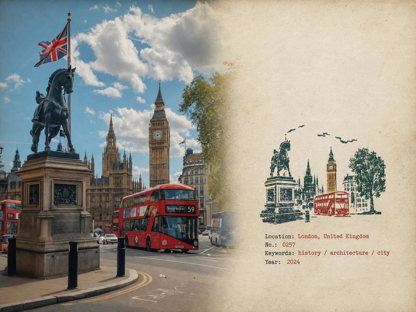
Rubber Stamp Travel Field Notes Poster AI photo style example on PhotoReady
PhotoReady | photoready.kaamkardo.com
Custom Creator Style

Rubber Stamp Travel Field Notes Poster

Created by
@gpt-image-2-library

Rights holder? Request removal via our contact page.

#Posters & Typography#UI#Poster#Realistic#Tech#Commerce#Social
Freeper generation
Secure transactions and inputs
Outputs completed in under 15 seconds
Powered by Photo Ready Engine
Use this prompt in

Every click copies the prompt. ChatGPT and Grok open with it already typed; the rest need one paste.

Prompt Template
Free Access
Rubber Stamp Travel Field Notes Poster — Natural Realism Version Create a separate “Rubber Stamp Travel Field Notes Poster” for each photo I upload. Output each photo individually. Never create a collage or combine multiple photos. Use a 4:3 landscape composition with a natural visual transition between the original photograph on the left and the aged-paper field-note area on the right. Do not add an obvious dividing line. LEFT — ORIGINAL PHOTOGRAPH The left side should occupy roughly 58% of the frame. Keep the uploaded photograph visually authentic and recognizable. Preserve the original subject, perspective, terrain, architecture, plants, people, spatial relationships, natural light, shadows, textures, and overall atmosphere. Do not redesign or reinterpret the photograph. Only apply a very subtle editorial photo treatment: gentle tonal balancing, restrained color grading, slightly softened highlights, and extremely fine natural film grain. It should still look like a real photograph taken on location rather than an AI-generated image. Natural cropping is allowed if needed to fit the 4:3 layout, but do not stretch, distort, move, replace, or redraw the main subject. Avoid excessive sharpness, HDR effects, artificial clarity, cinematic color grading, or overly perfect details. RIGHT — AGED PAPER FIELD NOTES The right side should occupy roughly 42% of the frame. Use warm off-white, slightly aged paper with a believable physical texture. Include very subtle paper fibers, fine grain, faint handling marks, and a matte surface. Keep large areas completely unprinted. The paper should feel like a real sheet from an architect's travel notebook or field journal, not a designed poster background. Avoid overly strong stains, decorative textures, vintage filters, or artificial grunge. SMALL RUBBER STAMP Study the uploaded photograph and identify only the few visual features that make the location immediately recognizable. Reduce them into a compact, imperfect multi-color rubber stamp impression. Do not reproduce the photograph element by element. Simplify aggressively and retain only the most meaningful visual relationships: - distinctive architecture and silhouette - important roof, tower, dome, arch, or structural shape - mountain or terrain contours - shoreline or road direction - a few recognizable trees or vegetation forms - simplified settlement layers - one or two important foreground shapes when visually relevant Remove crowds, cars, dense windows, repetitive buildings, tiny vegetation, decorative objects, and insignificant background details. The result should look like something a traveler could have actually carved into a small rubber stamp, not a miniature illustration of the entire photograph. Place the stamp in the lower-middle portion of the right paper area, occupying approximately 30–38% of the right section's height. Keep generous blank paper around it. Do not enlarge it into a large illustration. STAMP COLOR & PRINT CHARACTER Extract approximately 2–4 muted spot colors naturally from the original photograph. Possible colors include: - carbon black - deep green - brick or muted red - ochre - slate blue - taupe or earthy brown Do not force these colors if the photograph suggests a different restrained palette. Each color should appear as a separate physical ink layer. Make the print feel genuinely handmade: - slightly uneven pressure - tiny gaps in the ink - dry areas - paper showing through - rough carved edges - irregular line thickness - small contour breaks - granular ink texture - faint ghosting - slight natural color-layer misregistration - subtle edge variation The imperfections should be small and believable, as if the stamp was pressed onto paper by hand. Avoid perfectly aligned digital layers, smooth vector edges, clean gradients, or artificially exaggerated distress. The stamp should look physically printed, not digitally illustrated. FIELD-NOTE TYPOGRAPHY Generate a small amount of text based only on the actual location and imagery in the photograph: Location — English name No. — Number Three short English keywords Gregorian calendar year Place the text below or beside the stamp within the available whitespace. Use a small, understated typewriter or archival field-note style. The typography should have very slight mechanical irregularity, as though typed or printed on an old field notebook. Keep it quiet and secondary to the photograph. Spell the location and all words correctly. Do not add slogans, brands, tourist phrases, decorative quotes, or unnecessary text. OVERALL REALISM The finished image should feel like a real travel photograph mounted beside a small handmade field stamp on an architect's personal notebook page. Prioritize subtle physical realism over visual perfection. The photograph should remain the strongest visual element. The stamp should feel like a small fragment of memory extracted from the photograph rather than a second illustration. Use restrained contrast, natural imperfections, believable paper texture, and slightly imperfect printing. The final result should feel quiet, tactile, documentary, collectible, and genuinely handmade. Avoid Obvious dividing lines, circular seals, postage-stamp borders, perforations, wax seals, sticker layouts, souvenir-card designs, generic travel templates, smooth vector logos, polished digital illustrations, cartoon styling, 3D rendering, plastic textures, glossy gradients, excessive saturation, HDR effects, excessive text, decorative clutter, overly clean geometry, perfectly aligned ink layers, dense miniature architecture, or any alteration/redrawing of the original photograph.

Prompt explanation

The prompt anchors the model around posters & typography, then narrows the output with outfit, background, lighting, pose, expression, and camera instructions. The most important variables to preserve are face identity, realistic skin texture, clear eyes, natural proportions, and the professional portrait lens with realistic depth of field look.

Editable variables

OutfitBackgroundLightingPoseExpressionCamera

Expected output

A realistic posters & typography image with soft, realistic portrait lighting, a simple background that keeps attention on the face, a confident, approachable expression, and clear facial identity.

Common mistakes

  • Using a blurry or heavily cropped source photo.
  • Mixing formal and casual style instructions in the same prompt.
  • Adding too many props or background details.

Tips

  • Keep the clean, polished clothing that matches the intended use direction consistent with the final use case.
  • Preserve the soft, realistic portrait lighting and professional portrait lens with realistic depth of field terms when editing.
  • Use one clear face reference for the most reliable identity match.

Visual evidence for this style

Generated example for Rubber Stamp Travel Field Notes Poster

Generated example

Create unique travel posters featuring original photographs and aged paper notes, combining realism with a handmade rubber stamp impression for a personal.

Background detail for Rubber Stamp Travel Field Notes Poster

Background detail

a simple background that keeps attention on the face

LinkedIn preview crop for Rubber Stamp Travel Field Notes Poster

LinkedIn preview crop

a natural pose with clear face visibility with a confident, approachable expression.

About this style

Rubber Stamp Travel Field Notes Poster is a posters & typography style built for posters & typography images, profile photos, and creator visuals. It combines clean, polished clothing that matches the intended use, a simple background that keeps attention on the face, soft, realistic portrait lighting, a natural pose with clear face visibility, and a confident, approachable expression so the generated image feels intentional rather than random. The goal is not only to copy a prompt, but to understand the visual system behind the output.

This style is especially useful for professionals because it keeps the result focused on credibility, facial clarity, and repeatable framing. The professional portrait lens with realistic depth of field direction helps the image look closer to a real portrait session, while the background and lighting choices reduce distractions that can weaken a profile photo, resume image, creator bio, or portfolio thumbnail.

For best results, start with a sharp source image where the face is unobstructed and the head is not heavily cropped. Keep the outfit and background aligned with the final use case: more formal for LinkedIn, resumes, company pages, and founder bios; softer and more expressive for creator profiles, social media, and personal branding.

Structured style metadata

Category
Posters & Typography
Use case
posters & typography images, profile photos, and creator visuals

Best use cases for Rubber Stamp Travel Field Notes Poster

Create unique travel posters featuring original photographs and aged paper notes, combining realism with a handmade rubber stamp impression for a personal.

Who should use it

This style fits professionals who need a polished image for posters & typography images, profile photos, and creator visuals. It is useful when the photo needs to look credible, current, and easy to reuse across professional profiles.

Why this works

The combination of soft, realistic portrait lighting, a simple background that keeps attention on the face, and a confident, approachable expression makes the final image readable at small profile-photo sizes while still feeling realistic at full size.

Outfit guide

Use clean, polished clothing that matches the intended use. Avoid clothing that fights the style direction, especially busy patterns, oversized logos, or colors that clash with the background.

Background guide

The best background is a simple background that keeps attention on the face. It should support the subject without making the final image look staged, crowded, or overly decorative.

Camera and expression guide

Keep professional portrait lens with realistic depth of field, a natural pose with clear face visibility, and a confident, approachable expression. These details help the output read like a real portrait rather than a generic AI image.

Common questions about the Rubber Stamp Travel Field Notes Poster style

Is the Rubber Stamp Travel Field Notes Poster style free?

Yes. You can copy this style prompt directly from this page and use it in your own image tool.

What source photo works best with this style?

Use a clear portrait with good lighting, an unobstructed face, and minimal blur for the most realistic result.

Can I adapt the prompt?

Yes. Keep the core camera, lighting, and mood terms, then swap details such as outfit, background, or occasion. For this style the terms worth preserving are professional portrait lens with realistic depth of field and soft, realistic portrait lighting.

Which professions suit the Rubber Stamp Travel Field Notes Poster style?

It works best for professionals, and can be adapted for adjacent roles by changing outfit, background, and expression details.

What should I avoid?

Avoid low-resolution uploads, covered faces, extreme filters, crowded backgrounds, and instructions that conflict with the style metadata.

Can this style be used for a LinkedIn profile photo?

Yes, especially when the outfit, background, expression, and crop match the professional audience you want to reach. LinkedIn crops profile photos to a circle, so keep the face centred.

Related guides

More styles like this
Photo Ready Logo
Photo Ready